I promised to talk a little more about value and I got sidetracked by life. For my log cabin quilt (which is where the discussion started) I needed darks on one side of the block and lights on the other. The samples in this photo show the extreme light and dark. Most people don't even buy fabrics that dark (but I do).
When I am choosing my fabrics I try to have variations in color, scale, and texture. I could just use one light and one dark and it wouldn't look much different from the first photo. By using different scale (size) of print and choosing fabrics that give a feeling of texture you make a quilt interesting. I realize not everyone uses 100 or more fabrics in a quilt like I do. Even if you were limiting yourself to 12 fabrics, you need the variety within your value ranges so the quilt doesn't have a 'flat' look. So it isn't about color. Every color can be in the light values and every color can be in the dark values. It is the value range that is important.
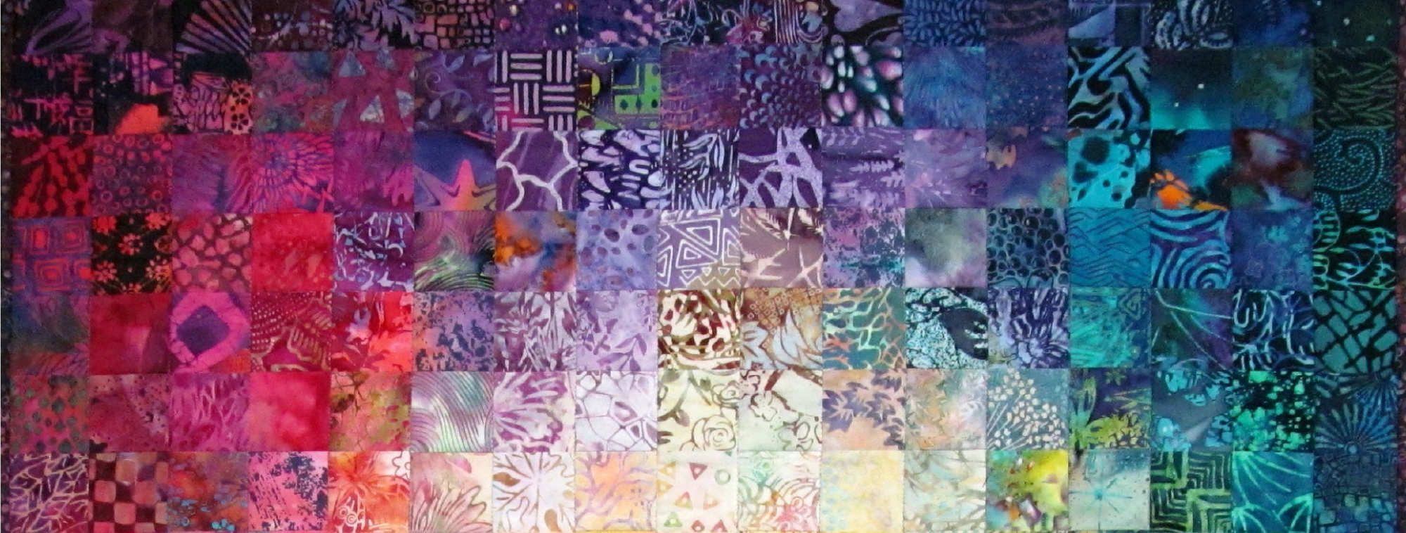
Here is a lesson I gave on blending the values from light to dark. If you want to see more samples on that subject click on Colorwash in the Labels list on my right side bar.
This is the new group of blocks I made for my ongoing triangle quilt project. I am using just 2 values in each block but I am varying the value ranges from block to block.
Here is one block of each of the 16 that I have made so far. In some of them the contrast between the 2 fabrics is high and in some it is low. I think that gives more interest to a quilt than having just high (or low) contrast in every block.
Most people love the medium range fun prints and tend to buy them most often for their stash.
The very light and very dark fabrics are there in the stores too but they aren't as interesting to look at and therefore don't get purchased as often. I had 2 last minute cancellations for my class yesterday so we had a very small class.
I put some trouble type fabrics into the kits for the class on purpose to show why they don't work as well when you want a blend of values.
I usually sew at night but I took the evening off last night and went to the see "Eat Pray Love". Did anyone read the book and see the movie? I'm curious how closely it followed the story in the book.
A lot of readers mentioned that they wanted to know more about working with value. Here is the way that I teach it:
Choose your assortment of fabrics.
Move the light fabrics to the left and the dark fabrics to the right. All of the ones left down the middle are medium tones.
Now divide the mediums into lights and darks and keep them together at the bottom of your area.
Now this picture is what you don't want to do. You don't want your lightest lights with the darkest darks because that leaves all of the mediums together and they will not contrast with each other.
This is what you do want to do, move the lightest darks up to match with the lightest lights.
Move the darkest darks to match up with the darkest lights.
As I am working I will make some low contrast pairs and a few high contrast pairs too so that I have movement in my design. Mostly you want the contrast between the light value and dark value to be easily seen. If you go back to the post with the triangle quilt on the design wall I think you will be able to pick out the blocks with the low contrast triangles.
I have the first 7 rows sewn together on the first triangle quilt so I'm half way there sewing the vertical seams.
There wouldn't be anyway to convince some people that a stash is necessary. They will only buy for a project and are at the mercy of the limited selection a quilt shop has on any given day. Of course if their projects only have 3-5 fabrics that isn't a problem. Try shopping for 100 florals for a colorwash on one day at one quilt shop.When I would give the colorwash one piece at a time class I would always get the resistance from a couple people with, I don't like light fabric, or I don't like dark fabric, just give me the medium values. That is what you see above, and I have to admit it is pretty, but from a distance.......it is mush. Below I have added the light values which gives it a little more interest. Then I add the dark mediums. I'm liking it better. And finally with all of the darks in there the piece glows. I put this example up on the wall today for in progress shots, in 15 minutes or less. It definitely needs tweaking if I was going to sew it. All of these squares are from the 116 pc. kit on my blog-shop. The point I am trying to make is that with a full range of value, the pattern of the quilt will show up. With fabrics in a "too close" value range, you will see none or very little pattern from a distance. To be sure you have values that separate and that will enhance each other, you need to step 8 feet away from the selection of bolts at the store, as if you were viewing the quilt from the doorway of the bedroom. Mix the bolts up in different arrangements to be sure you like each bolt against each other bolt.